The Six Principles of Restaurant Menu Design 餐厅菜单设计的六项原则
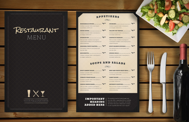
When sitting down to design your menu, make sure that the menu layout is specific to your restaurant or event. Brainstorm a bit, think about what makes your restaurant unique. The thoughts that come to mind will help give your menu a unique style and flavor all its own. Careful attention to your menu's layout can help you do that. Even if you are a novice designer, following these general principles will result in a dynamic, professional menu customers love.
坐下来设计菜单时,请确保菜单布局特定于您的餐厅或活动。有点头脑风暴,想想是什么让您的餐厅与众不同。这些想法将帮助您的菜单拥有独特的风格和风味。仔细注意菜单的布局可以帮助您做到这一点。即使您是新手设计师,遵循以下一般原则也将导致客户喜欢动态,专业的菜单。
Principle #1: Page Size Comes First 原则1:页面大小至上
- Menu size is the first and most important design element. Generally this is dictated both by the number of dishes you offer as well as the look you desire.
- 菜单大小是最重要的设计元素。通常,这取决于您提供的菜肴数量和所需的外观。
- Family restaurants that offer tons of options and lots of kids' fare do well with Tabloid-Size Menus that fit everything in one place. Less option-heavy, more upscale restaurants often prefer standard sizes.
- 提供多种选择,一应俱全的Tabloid尺寸菜单非常适合提供多种选择和多种儿童票价的家庭餐馆。选项数量较少,高档餐厅通常更喜欢标准尺寸。
- Drinks, specials, happy hours and occasions often benefit from their own menu sizes, so consider your needs before choosing a page size.
- 饮品,特色菜,欢乐时光和场合通常会从其菜单大小中受益,因此在选择页面大小之前请先考虑您的需求。
Principle #2: Columns Make a Statement 原则2:单列
- Typically, fine dining restaurants choose a single column and wide margins for simple, elegant appeal. This is also true of other limited-selection menus, like daily specials or this Happy Hour Menu.
- 通常,高级餐厅选择单列和宽边距来获得简单,优雅的吸引力。其他限时选择的菜单也是如此,例如每日特色菜或欢乐时光菜单。
- Family-oriented restaurants often use multiple columns on front and back to contain their wider range of items, as do cafes and pubs.
- 面向家庭的餐厅,咖啡馆和酒吧经常在正面和背面使用多列来容纳更多商品。
- Keep in mind that items with long descriptions don't look as nice squeezed into a column as those with shorter or nonexistent descriptions.
- 请记住,带有简短描述的项目不会像带有简短描述或不存在描述的项目那样挤入列中。
- Also remember that menus with only one column tend to be boring unless you pay special attention to getting placement, emphasis, proportion and balance right.
- 还要记住,只有一栏的菜单会很无聊,除非您特别注意正确放置,强调,比例和平衡。
Principle #3: Placement Affects Visual Appeal 原则3:布局会影响视觉吸引力
- Much of placement is dictated by the progression of the meal (from Starters to First Course to Second to Dessert, for instance), but you have room for creativity, so use it.
- 进餐的大部分时间取决于进餐的进度(例如,从开胃菜到第一道菜再到第二道菜,最后到甜品),但是您有创造力的余地,请使用它。
- In a multiple-column menu, play with placing categories below versus next to each other. Salads might go directly below Soups, for example, or look better to the right.
- 在多列菜单中,将类别放置在下方。例如,色拉可能直接在汤下面,比在右边看起来更好。
- Ensure roughly the same number of dishes between two columns and on the front and back of a menu to avoid a petered-out effect. Distribute logos and graphics evenly, like this Cafe Menu.
- 确保两列之间以及菜单的正面和背面的菜品数量大致相同,以免造成影响。像此咖啡馆菜单一样,均匀分布徽标和图形。
Principle #4: Emphasis Draws Attention 原则4:重点要突出
- A highlighted box or colored area, like the one used in this French Menu, will quickly draw a customer's attention.
- 像此法语菜单中使用的那样,突出显示的框或彩色区域将迅速吸引客户的注意。
- Increased negative space (white or empty space) around a column, category or menu item will draw the eye toward it.
- 列,类别或菜单项周围增加的负空间(白色或空白区域)将吸引眼球。 仅包含一项的类别将始终引起注意。
- Categories with only one item will always draw attention. If your restaurant serves a single dessert (like flan at a Mexican restaurant) or has a long-offered specialty, place these items in a category by themselves.
- 如果您的餐厅只提供一种甜点(例如墨西哥餐厅的果馅饼)或长期提供的特色菜,请将这些物品单独放置在一个类别中。
Principle #5: Proportion Signifies Choice 原则5:比例代表选择
- Menus with similar numbers of dishes in each category assure customers they have choice, so break sections up as evenly as possible.
- 每个类别中菜肴数量相似的菜单可确保顾客有选择余地,因此请尽可能均匀地分配食品种类。
- Consider combining categories with only one or two items each, like putting soups and salads both in 「Starters.」 Conversely, break up categories that are overly dense by using subcategories.
- 考虑将类别仅包含一个或两个项目,例如将汤和沙拉都放入「开胃菜」中。相反,通过使用子类别来分解过于密集的类别。
- If you have tons of beverages, don』t crowd them on to the back of an otherwise elegant menu. Use a separate Drink List and divide them proportionally.
- 如果您有大量的饮料,请不要将其挤在其他菜单上。使用单独的饮料清单并按比例划分它们。
- Make sure sections that don』t require descriptions (sides, beverages or kids』 items) are laid out similarly to everything else.
- 确保不需要说明的部分(配餐,饮料或儿童用品)的布置方式与其他所有方式相似。
Principle #6: Balance Is Beauty 原则6:平衡就是美
- Your restaurant name and logo should balance with the rest of the menu in both size and appearance. Make sure they stand out without taking over, like this Steak House Menu.
- 您的餐厅名称和徽标应在菜单的大小和外观上与其余菜单保持平衡。确保他们脱颖而出而不接手,例如」扒房菜单「。
- All columns of your menu as well as its front and back should contain roughly similar amounts of text. If necessary, rearrange your sections or break them up differently to achieve good flow.
- 菜单的所有列以及其正面和背面应包含大致相似的文本量。如有必要,重新排列您的节或以不同的方式将其分解以实现良好的流动。
- Negative space is important. Use it to set off elements that you want people to notice.
- 负空间很重要。使用它来设置您希望人们注意到的元素。
- Balance is achieved when all sections of your menu echo the others. Consistency will result in beauty with little effort on your part.
- 当菜单的所有部分都与其他部分呼应时,可以达到平衡。
With these simple principles and strategies, you can create a pleasing menu that your customers will find both useful and intriguing.
一致性将使您轻松完成菜单美化工作。 通过这些简单的原则和策略,您可以创建一个令人愉悦的菜单,您的客户会发现它既有用又有趣。